Line
The Line Widget is usually used to monitor values that are constantly changing, something like temperature, humidity, battery, etc. This type of widget is the most used to show node field values and for some nodes with model, one or more of this type of widget are auto created.
Fields
Line type widgets have a lot of fields, they are therefore very customizable and can therefore cover many situations.
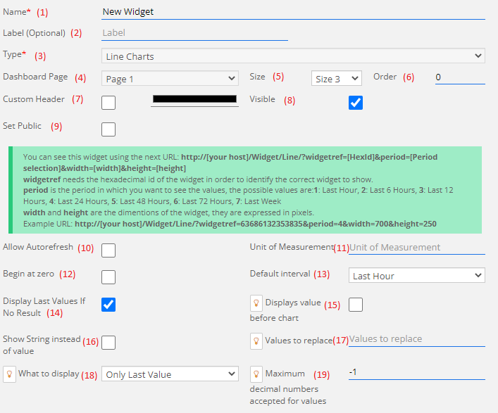
1) Name: This field will contain the name of the widget, in case that this widget was created automatically then this field will be blocked.
2) Label (optional): This is an optional field, if it isn't empty then it will replace the name shown in the dashboard.
3) Type: The type of the widget, in this case it will always have the "Line" value and cannot be changed.
4) Dashboard Page: In which page of the dashboard you want to create the widget, if you are creating the widget directly from the dashboard page then this field is blocked.
5) Size: Width of the widget, it can range between 3 and 12, the height of the widget is auto-adjusted depending on the width.
6) Order: Order of the widget inside of the page.
7) Custom Header: If checked, this allow you to select a custom color to use as the header of the widget instead of the default color.
8) Visible: Choose if you want the widget to be visible or hidden.
9) Set Public: This check allow you to create a link that can be used outside of the ResIOT platform to visualize the widget.
10) Allow Autorefresh: If it is checked then the widget will start with the Autorefresh on, refreshing the widget every 30 seconds.
11) Unit of Measurement: Custom UM fot the widget.
12) Begin at zero: If it is active than the y-axis values for the widget will always start from 0.
13) Default interval: Select what interval you want the widget to start from.
14) Display Last Values if No Result: With this check if in the default interval no data is found then the interval is automatically changed to "Last Values" to show the last 2 available values.
15) Displays value before chart: Instead of opening the widget with the chart, it will open with the secondary page that shows only the last value.
16) Show String instead of value: If this field is checked than replace certain values on the y-axis with a string based on the content of the next field.
17) Value to replace: If the previous field is checked than the content of this field will be used to replace certain values on the y-axis with strings. The format of this field is "Value:String;" so for example if you want the string "Active" on the value 1 and "Deactive" on 0 the value of this field will be "1:Active;0:Deactive;"
18) What to display: Select the type of values to display in the secondary window.
19) Maximum decimal numbers accepted for values: The number of max decimal that are allow for any value. If it is execeeded than the value will be automatically rounded to the selected value.
Other Fields
These fields let you decide what lines do you whant in the widget:
Widget Elements
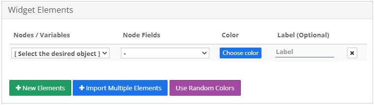
This section let you choose which data you want to show. in the field Nodes/Variables you can, as the name says, choose either a Node or a Variable to show in the widget. If you choose a Node then the field Node Fields will unlock and populate with the node's numeric Fields which only one can be selected for any Widget Element line. The field Color is the color that the line will take, meanwhile if the field Label is full it will replace the name of the Node Field shown in the widget.
If you need to insert multiple Nodes or Variables you can click the Import Multiple Elements button to insert all of them at once.
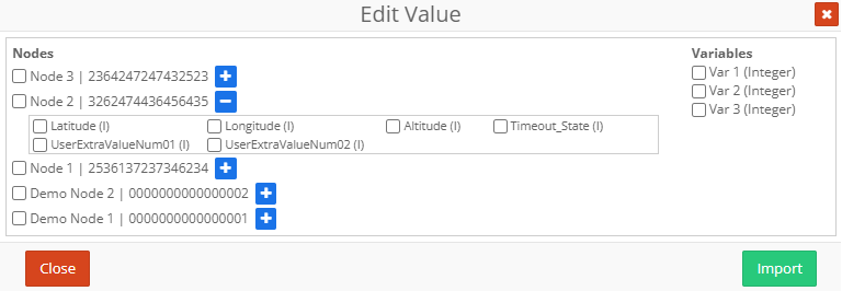
Select the Nodes and Variables that you want to inport and for all the selected Nodes select the Node Field that you want to show, if none is selected than the first available Node Field will be selected. Once you are done click on the Import button to insert in the Widget Elements what you choose.
Static Lines
Static Lines are horizzontal lines that can be added to the widget, they can be used to mark a maximum/minimum value or just as a simple marker.
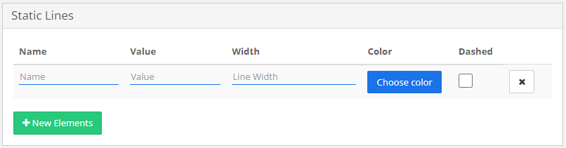
The Name field is more of a description than a name since it isn't shown on the widget, Value and Width are the position and the width (in pixel) of the line and the fields Color and Dashed are to specify the color of the line and the format, straight if Dashed isn't check, and dashed if it is.
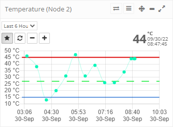
Widget Example
Here's as an example of a linear widget used to check the value of the temperature. As we need to check that the temperature is neither too hot or too cold, we inserted 2 Static Lines, one to indicate the maximum expeted value and one the minimum expeted value, so that we can easily check if something is wrong. Then we added a third line to indicate the optimal value and to differentiate it instead of a strait line we made it a dashed one.