Bars
The Bar Widget is usually used to monitor the capacity of an object or to easily compare different values. This is one of the type of widgets in which you have the possibility to manually customize it.
Fields
This widget type doesn't have many fields other than the one that are common for all widget types, but as said before this type can be customized manually so it can open to a lot of possibilities.
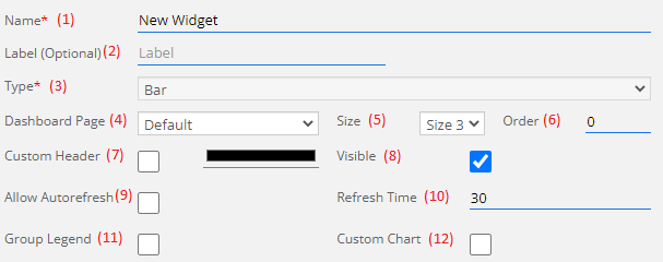
1) Name: This field will contain the name of the widget.
2) Label (optional): This is an optional field, if it isn't empty then it will replace the name shown in the dashboard.
3) Type: The type of the widget, in this case it will always have the "Bar" value and cannot be changed.
4) Dashboard Page: In which page of the dashboard you want to create the widget, if you are creating the widget directly from the dashboard page then this field is blocked.
5) Size: Width of the widget, it can range between 3 and 12, the height of the widget is auto-adjusted depending on the width.
6) Order: Order of the widget inside of the page.
7) Custom Header: If checked, this allow you to select a custom color to use as the header of the widget instead of the default color.
8) Visible: Choose if you want the widget to be visible or hidden.
9) Allow Autorefresh: If it is checked then the widget will start with the Autorefresh on, refreshing the widget at a time specified in the next field.
10) Refresh Time: If Allow Autorefresh is checked then the time of the refresh is set here. Default is 30 seconds, otherwise it can't be below 5.
11) Group Legend: When this field is checked, the widget will cycle all the Widget Elements and check if there are more than one Node with the same Fields then it will regroup all the Fields with the same name in the same column instead of creating new columns for every Field.
12) Custom Chart: This check is the one that allow you to activate the manual customization, in case it is not check then some standard options will be shown instead.
No Custom Chart
In case you choose not to use the Custom Chart then the next 3 option will became available:
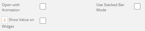
- Open With Animation: At the load of the widget, the bars will have a load animation.
- Use Stacked Bar Mode: This option will group all the bars of a Node or Variable into one column each.
- Show Value on Widget: Inside of the bars there will be written a number for easy check of the value of that bar.
Custom Chart
If the field Custom Chart is checked then this button will appear.
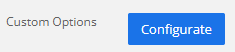
On click of the button, a new window will appear where you will be able to write your options.
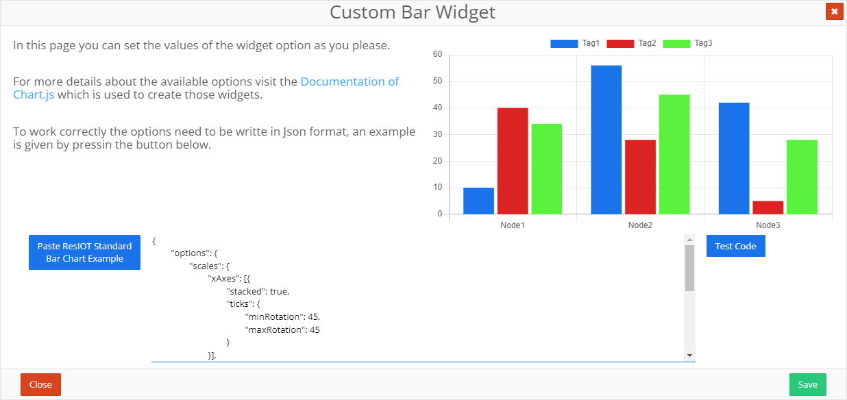
In the certer field there is the space where you can write your own options. If you want an example of options, you can click on the Paste ResIOT Standard Bar Chart Example button and a sample text will be written in the center field. Once you are done writing, you can click on the button Test Code to see if your options work correctly, if it is all written correctly the the widget on the top right will show a preview of a widget with your options, otherwise if something is wrong a red message under the Test Code button will appear to signal the error.
Widget Elements
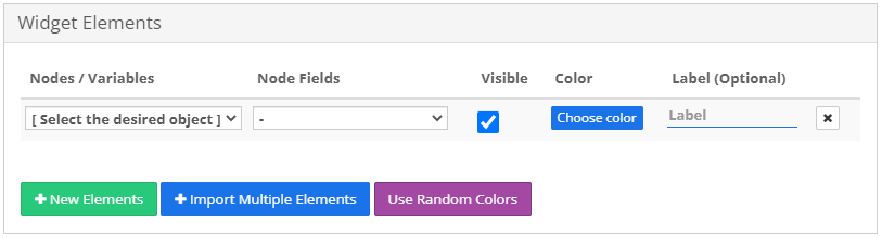
This section let you choose which data you want to show. in the field Nodes/Variables you can, as the name says, choose either a Node or a Variable to show in the widget. If you choose a Node then the field Node Fields will unlock and populate with the node's numeric Fields which only one can be selected for any Widget Element line. The field Visible allow you to show or hide one bar without having to remove it from the Widget Elements. The field Color is the color that the line will take, meanwhile if the field Label is full it will replace the name of the Node Field shown in the widget.
If you need to insert multiple Nodes or Variables you can click the Import Multiple Elements button to insert all of them at once.
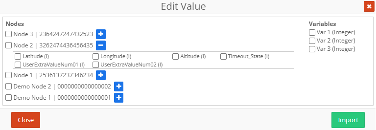
Select the Nodes and Variables that you want to inport and for all the selected Nodes select the Node Field that you want to show, if none is selected than the first available Node Field will be selected. Once you are done click on the Import button to insert in the Widget Elements what you choose.
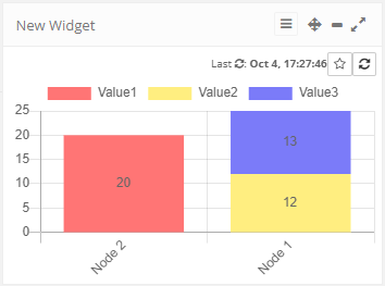
Widget Example
Here's an example of a bar widget containing 3 values from 2 Nodes. For this example we used a Stacked Bar to show the comparison between a single value of a Node and the sum of 2 values from another Node.